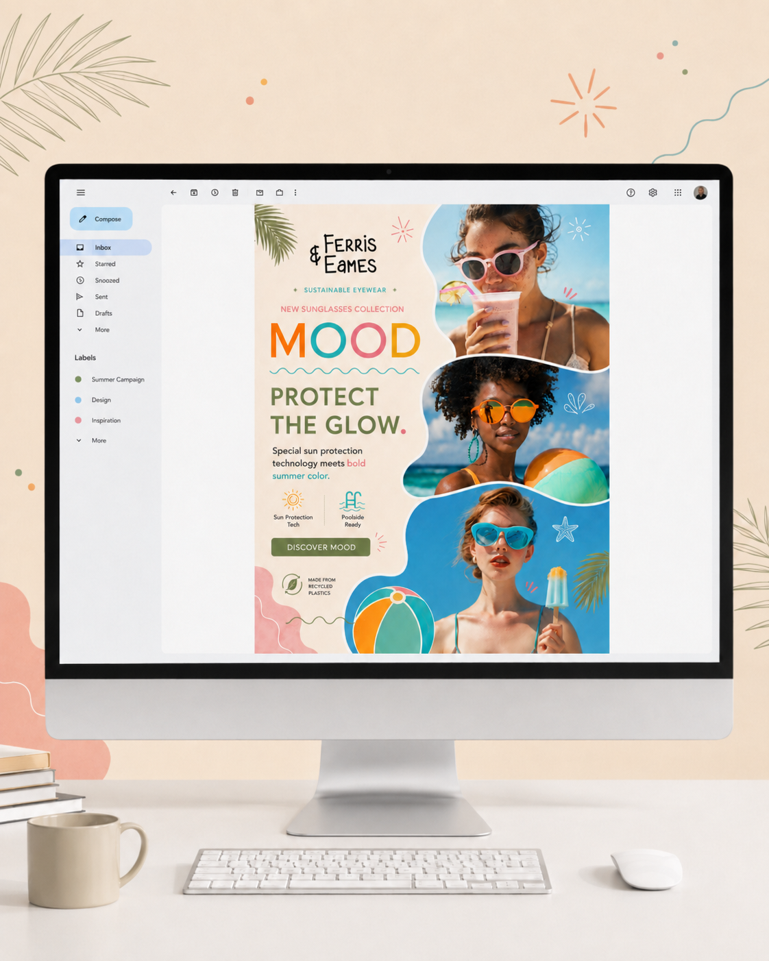

Ferris & Eames
Eyewear Company
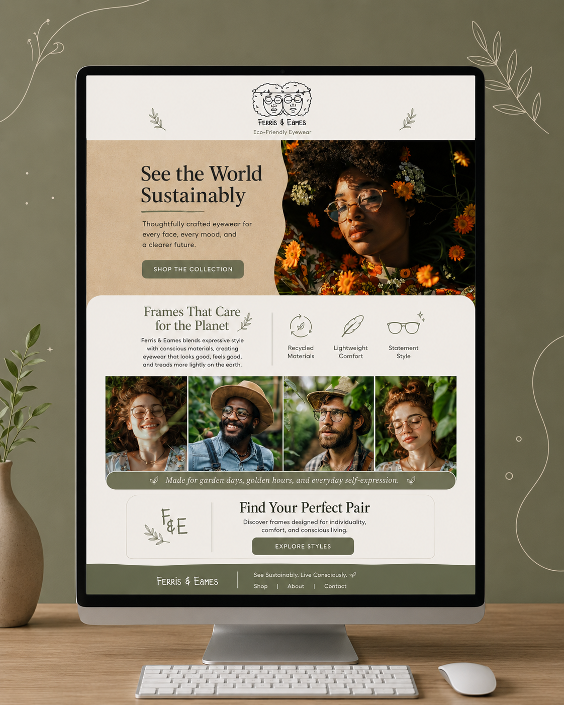
Logo Design/Email Newsletter
Ferris & Eames is a sustainable eyewear brand creating frames from recycled materials. For the visual identity, I wanted the brand to feel personal, expressive, and environmentally conscious while standing apart from the polished, minimal aesthetic often seen in eyewear branding.
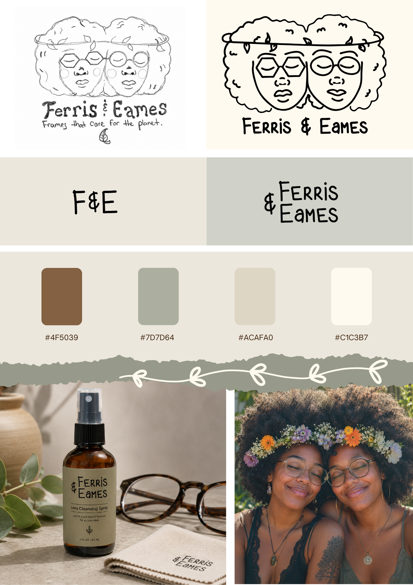
The primary logo is a custom illustration inspired by the company’s owners who happen to be twin sisters. I developed the artwork from an original hand-drawn concept, depicting the sisters side by side in distinctive geometric and round eyewear. The organic linework and botanical details give the identity a warm, handcrafted quality while connecting the brand visually to its sustainability-focused mission.
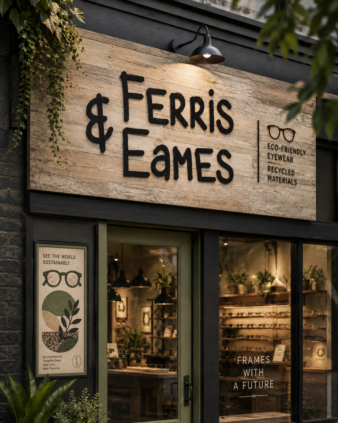
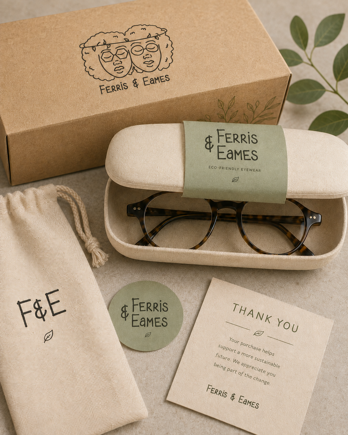
To create a flexible identity system, I expanded the primary illustration into a suite of supporting marks, including a hand-lettered Ferris & Eames wordmark, a simplified stacked logo, and an F&E monogram. These variations allow the brand to remain recognizable across everything from eyewear packaging and cases to stickers, fabric pouches, tissue paper, and digital applications.
The final identity combines personality with purpose: a brand rooted in the relationship between its founders while reinforcing Ferris & Eames’ commitment to thoughtful design, recycled materials, and a more sustainable future.